Photo batches drift over time
Product photos captured on different days often end up warmer, cooler, brighter, or flatter than the rest of the collection.
Use a reference image to make product photos feel more consistent across listings, collections, catalogs, and launch assets. Fowish helps align tone and color direction without forcing you into a generic preset workflow.

Common problems
Most product photo sets do not fail because a single image looks bad. They fail because multiple images no longer feel like they belong together.
Product photos captured on different days often end up warmer, cooler, brighter, or flatter than the rest of the collection.
Even small changes in lighting, studio setup, or camera settings can make catalog and listing images feel disconnected.
Copying an edit from one product image to another rarely produces a consistent result when the source shots differ.
Why Fowish fits this workflow
Bring warmer and cooler product photos closer to one visual direction.
Reduce repetitive manual editing across catalog or launch batches.
Match the feel of a chosen hero image, campaign visual, or approved reference shot.
Continue refining the result in the image editor when you need extra control.
Good fits
Product listing photos
Catalog and collection images
Lookbook product shots
Detail page visuals
Launch campaign assets
Studio reference looks
Workflow
Start with the product photo that feels out of sync with the rest of your catalog or campaign.
Use a photo that already matches the tone, mood, and color direction you want to keep across the set.
Fowish aligns overall color direction, warmth, and visual feel based on the reference image instead of a generic preset.
Once the tone is close, continue refining highlights, contrast, and color strength in the image editor if needed.
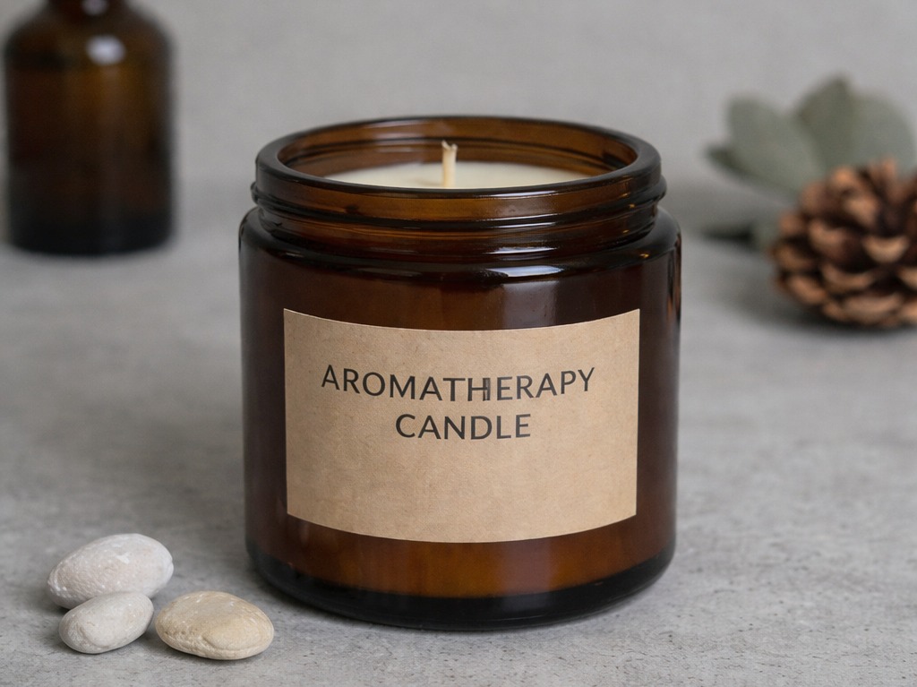
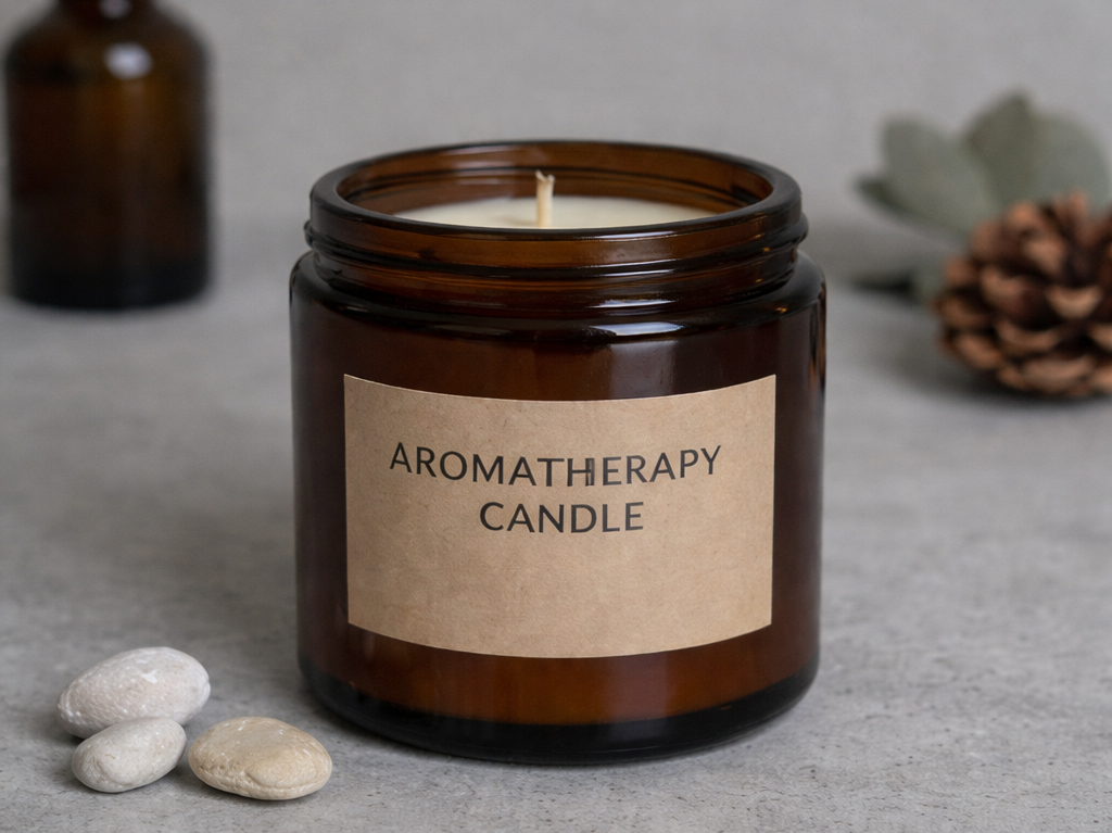
Before and after
A colder or flatter product shot breaks visual rhythm when it appears next to warmer, richer images.
The image feels closer to the same collection, making product listings and campaign sets appear more deliberate.
Better consistency supports cleaner catalogs, more polished launches, and stronger brand presentation across product pages.
FAQ
Yes. This is one of the clearest use cases. If your product images were captured in different lighting conditions or on different shoot days, a reference image can help move them closer to one visual direction.
Yes. A strong reference image can act as the visual anchor for a collection, campaign, or catalog batch. You can reuse that look to make product photos feel more consistent.
The goal is not to distort the product but to align the overall tone, warmth, and mood. You should still review the output, especially when accurate product appearance matters.
For many product photography workflows, yes. Presets apply the same adjustment recipe to every image, while reference-based matching is more useful when the source images differ in lighting or exposure.
Yes. After generating the matched result, you can continue in the image editor to fine-tune brightness, contrast, saturation, warmth, and other adjustments.
Yes, but results depend on the input images and the reference you choose. It works best when the goal is to align overall color direction while keeping the product presentation clean.
Ready to try it?
Upload a target image and a reference photo to create a more unified look across your product visuals, then fine-tune the result if needed.